New Trails
- Blue Carbon Design

- Jul 9, 2020
- 1 min read

This Brand Identity is modeled to showcase a relevant and smart design that matches the up and coming “Hidden Treasure” community in Gardner Kansas, and appeal to the trend forward audience that frequents places like The Legends, Lenexa Public Market, and Prairie Fire.
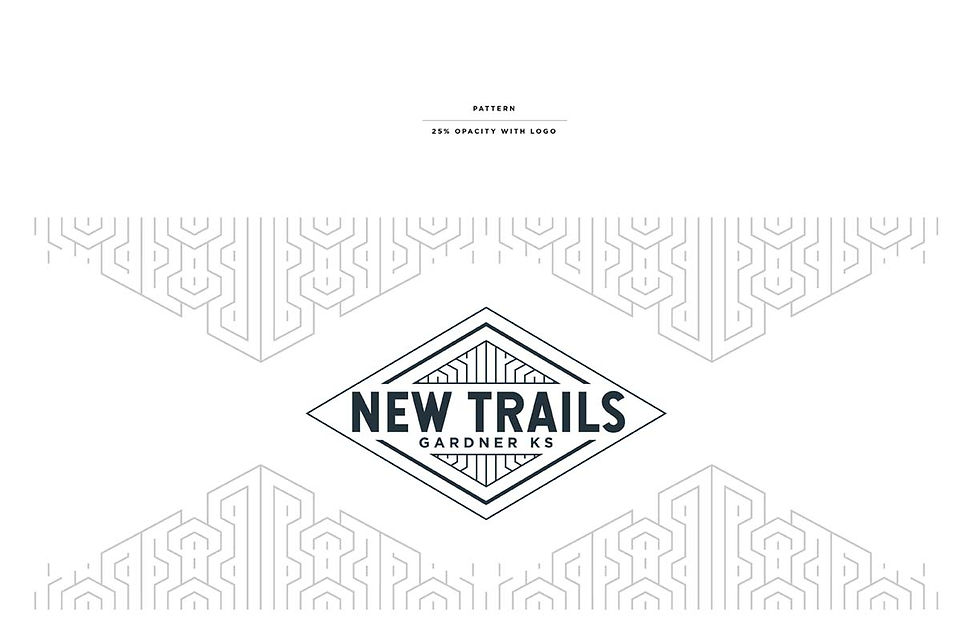
This is a very Modern design with a twinge of Art Deco, which is chic yet stands the test of time. And also competes well with other notable Modern/Art Deco Kansas City based brands (see Roasterie Coffee, Boulevard Brewing Company, and more).

Typography
For type it is important to consider style and readability.
Hansief was chosen for the Heading, as a bold and easily read san-serif. With unique O’s which matches the modern/art deco style that’s so popular in the Kansas City area.
For the second heading and body text Gotham was chosen for its style, readability, and versatility (it’s a big Font-Family).

See the Final New Trails Branding Packet:
See Prospective Options for the New Trails Branding:


Comments